


Public Strategies
Brand Redesign

PROJECT OVERVIEW
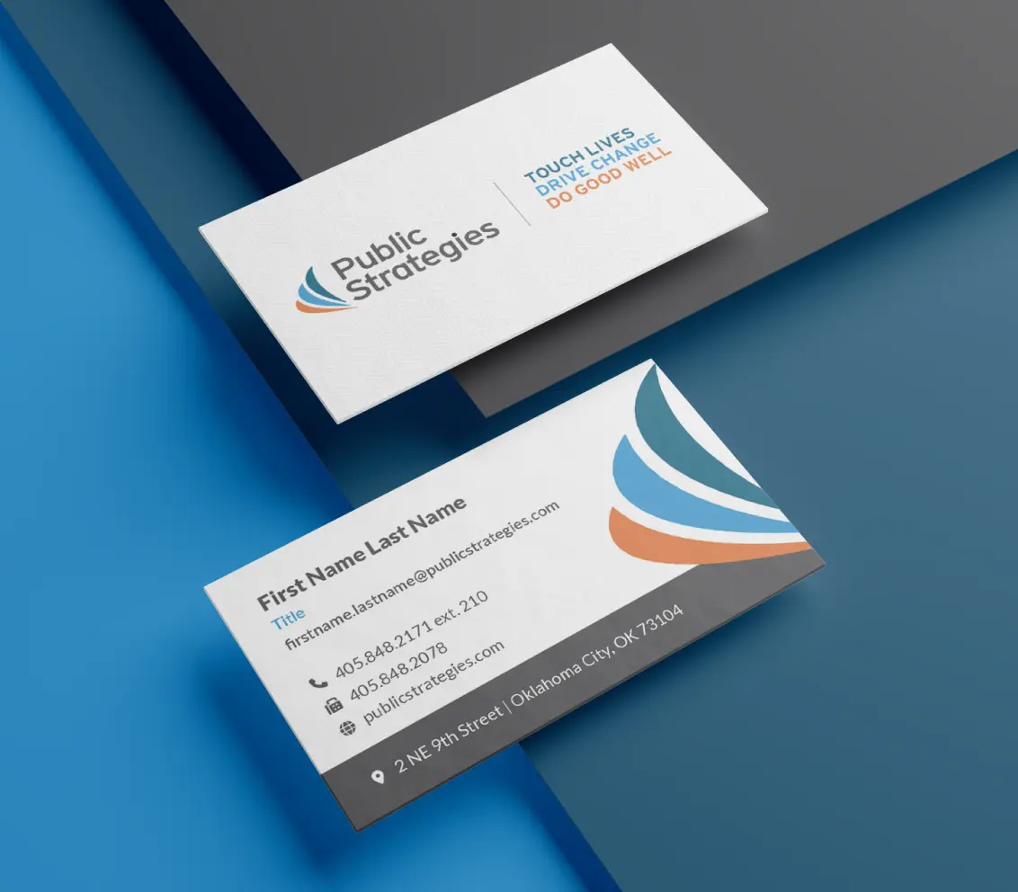
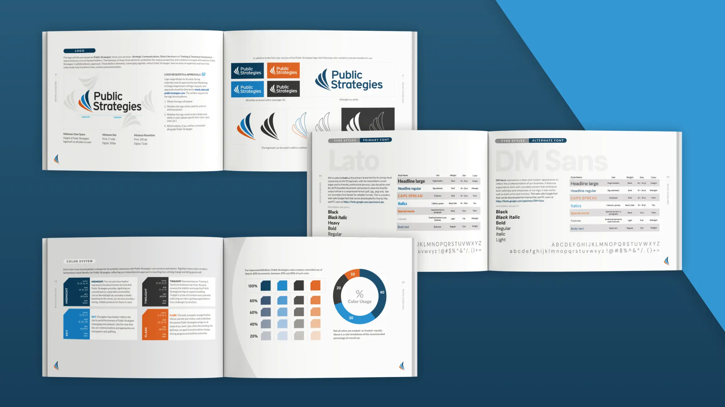
Public Strategies’ brand has evolved over more than three decades of work, reflecting the firm’s expanded service portfolio. Our most recent identity refresh streamlined the logo icon, modernized the typeface and updated the color palette.
The logo artfully encompasses Public Strategies’ three core services—Strategic Communications, Direct Services and Training & Technical Assistance—represented as a trio of fanned feathers. The interplay of these three elements symbolizes the unique perspective and combined strength afforded by Public Strategies’ multidisciplinary approach. These distinct elements, converging together, reflect Public Strategies’ diverse areas of expertise and how they collectively help transform lives, systems and communities. Similarly, each color in the brand palette is chosen for its symbolic resonance with Public Strategies’ core services and mission.
What We Delivered
- Logo and brand identity development
- Collateral materials
- Signage
- Social media
- Award-winning website


What We Delivered
Logo and brand identity development
Collateral materials
Signage
Social media
Award-winning website

In-house Brand Redesign


High-fidelity Prototyping

Website Design



 Public Strategies New Year’s Mailer
 2023 DDS PossABLE Statewide Training
 TRUE Dads
 Citizen Potawatomi Nation
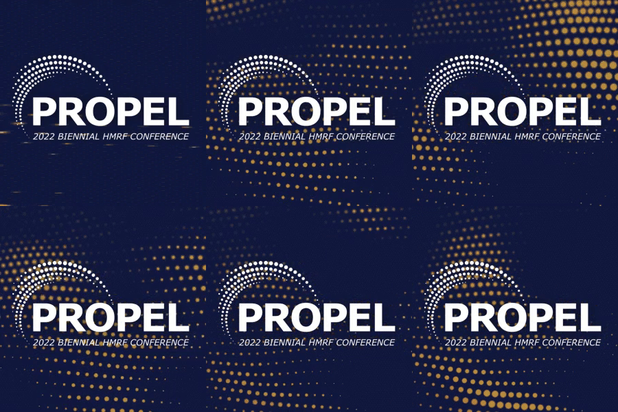 PROPEL Nationwide Virtual Conference
 WORKlahoma Job Fair
 2023 DDS PossABLE Statewide Training
 Wellspring Weekend